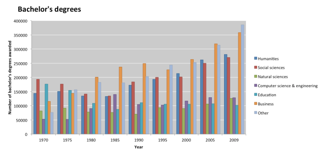
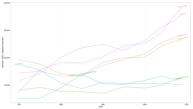
At the Crooked Timber, there is an ugly graphic. A bar plot to represent a time series of grouped data. I was so annoyed by the graphic that I decided to make a version of my own. The data I got from here. The R code to reproduce the graphic is below.
The original one:
And my version (it would be possible to polish it a bit more, but I’m satisfied for now.
### My code
require(ggplot2)
require(reshape2)
library(directlabels)
library(scales)

## I downloaded an excel file, copied into Google Docs, make some cleaning there, than exported
## as a tsv file to my local computer.

## Some data cleaning and prep
df <- read.table("crisisHumanities.tsv", header=T, sep="\t")
colnames(df)[1] <- "ano"
df[,1] <- as.numeric(substr(df[,1], 1,4))
head(df)
df <- na.omit(df)
head(df)
df <- df[,-2]
names(df) <- gsub("\\.", "", names(df) )
names(df) <- gsub("2*3*", "", names(df) )

mydf <- melt(df, id="ano")
head(mydf)

mydf <- droplevels(mydf)

## relabeling
mydf$variable <- factor(mydf$variable, levels=levels(mydf$variable),
                        labels=c("Humanites", "Scial Sciences", "Natural Sciences",
                                "Computer science and engineering", "education", "business",
                                "Other fields"))
names(mydf)[2] <- "field"

## fixing issue with comma (Brazilian and US number formats are different regarding decimals)
mydf$value <- as.numeric(gsub(",", "", mydf$value))

## plotting
p <- ggplot(mydf, aes(y=value, x=ano, group=field)) + geom_line(aes(colour=field)) +
  ylab("Number of B.A. degrees awarded") + xlab("year") + theme_bw() +
  theme(legend.key = element_rect(colour = "white")) + scale_y_continuous(labels=comma)

## putting labels. Not very satisfied, but it`s ok
p <- direct.label(p,
             list("top.points", rot=10, cex=1,
                  fontface="plain", fontfamily="serif", alpha=0.9))
# saving
ggsave(plot = p, "crisis_humanites.png", h = 9, w = 16, type = "cairo-png")
I’d be very glad if the original poster considered to change his graphic by mine.


I feel more enlightened on this topic after reading your article. Your content is fascinating, persuasive and thought-provoking. I just wish I were good with words like you so I could express my appreciation better.